
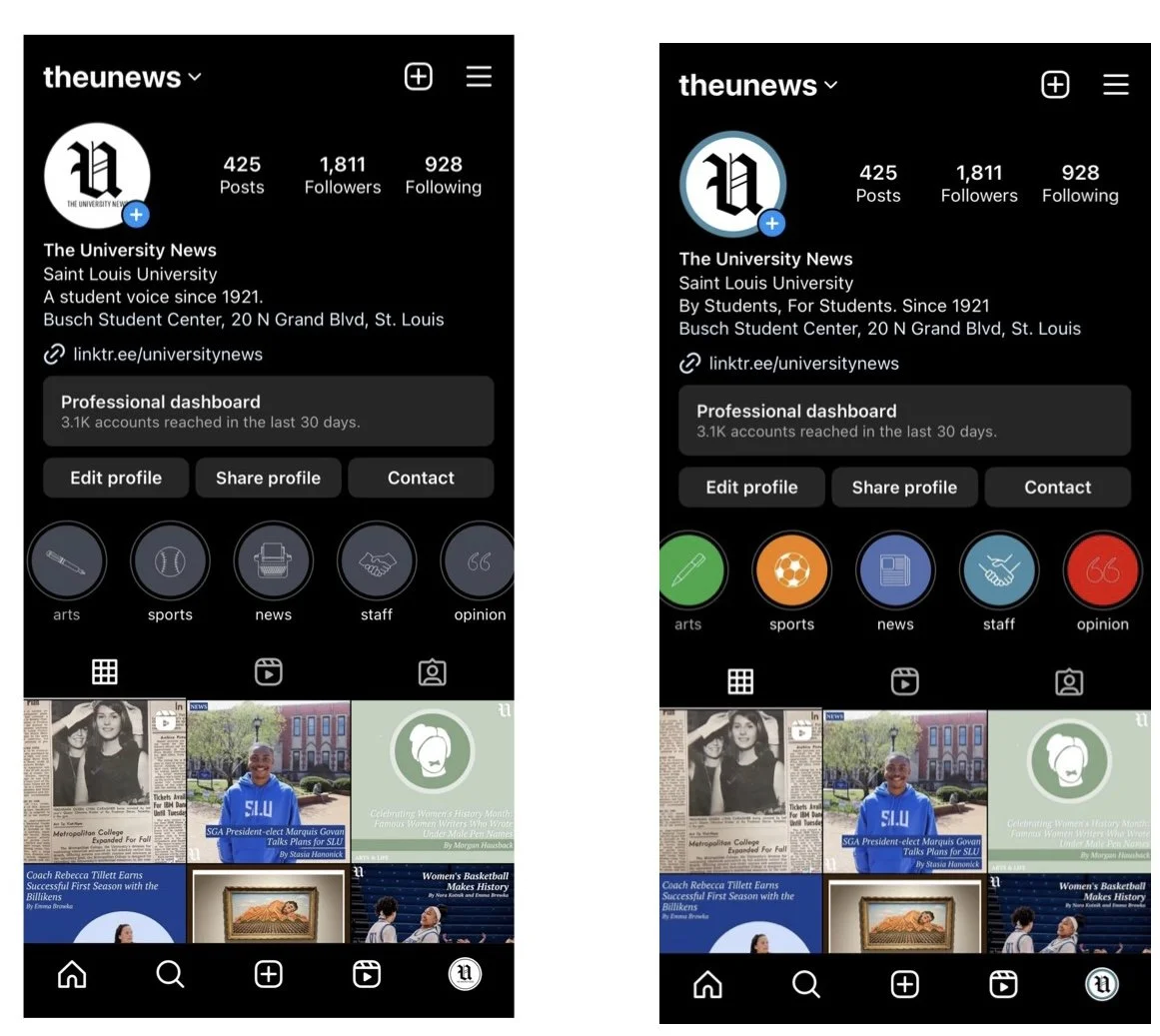
The University News Rebrand
As my final project with The University News, I led a rebrand of the publication to better reflect the identity of our student-run newspaper. The team had been questioning how we wanted to present ourselves and whether our design still matched the kind of stories we were telling. Unlike traditional newspapers, The UNews publishes once a month and covers a wide range of topics beyond campus news. The rebrand focused on creating a look that felt more modern, eye-catching, and reflective of the creativity of our student writers and designers.

Mission Statement
As part of the rebrand, I developed a new mission statement: “By Students, For Students.”
The goal was to clearly communicate the purpose of the publication. Every writer, editor, and designer involved in The UNews is a student, and the publication exists to share stories that matter to the SLU community both online and in print.
Visual Identity
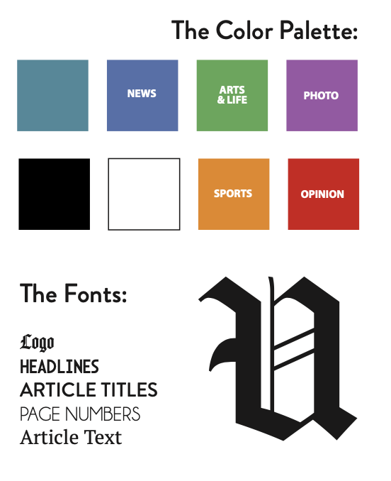
The new visual identity introduced updated colors, typography, and a redesigned logo to create a more engaging and recognizable look.
Each section of the paper was assigned its own color to help organize content and make pages more visually dynamic. Updated typefaces added a modern feel while still maintaining the readability expected from a newspaper.
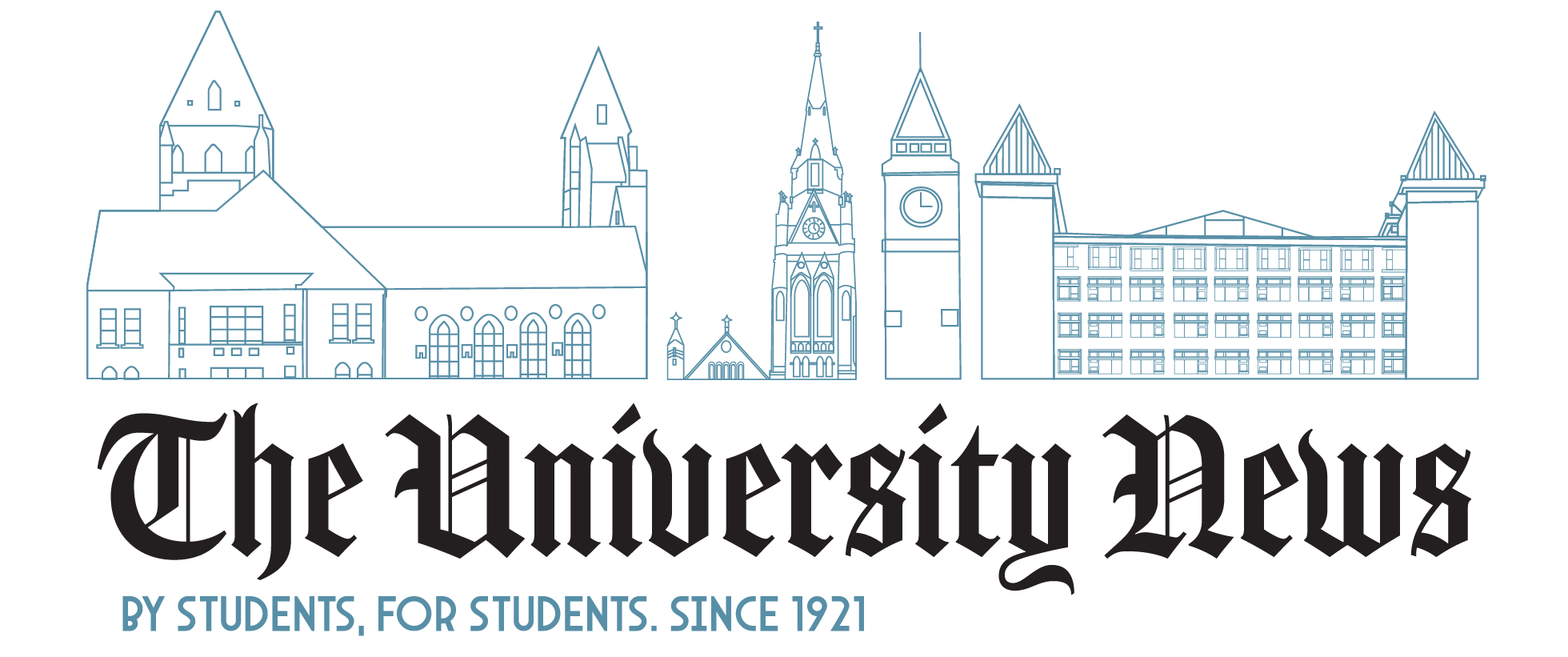
For the logo, I illustrated several Saint Louis University campus buildings to incorporate a stronger connection to the university itself. While many design elements were refreshed, the gothic typeface of the logo was intentionally preserved to maintain a connection to the traditional look of a newspaper.